Arabic fonts for logos: how to choose one and make it your own
Arabic fonts for logos, checked and grouped by brand personality, with their Latin partners and licences, and how to turn a font into a drawn wordmark.
Published 11 min read
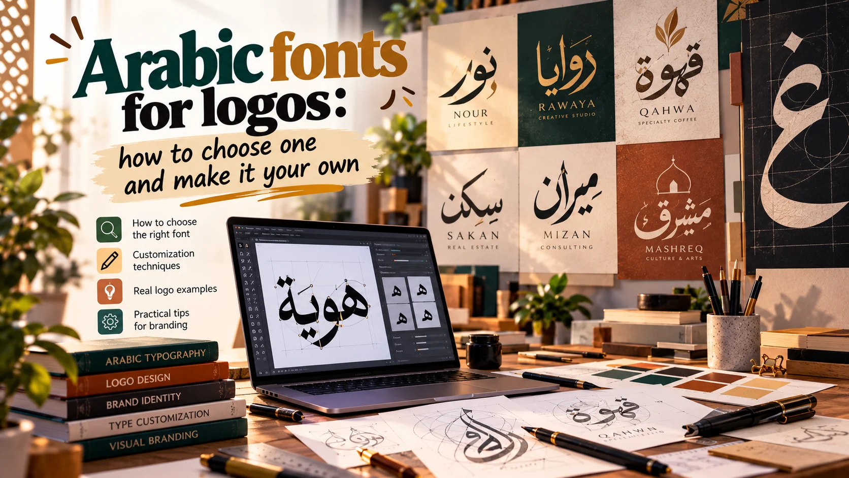
The best Arabic fonts for logos carry the brand's voice and set its own name well, not just the sample word on the font's page. Look for clear character, a structure you can build on, a Latin partner if the brand needs an English name, and a licence that allows logos and changes to the letters. Every font suggested here is free on Google Fonts under the SIL Open Font License, and I checked each designer and licence on its official page in October 2026.
Choosing the font is only half the job. A strong logo usually starts from a font and ends as drawn or modified lettering that no other brand owns, because anyone can download the font and type the same name in a minute.
Below: picks by brand personality, licences, the steps from font to wordmark, bilingual lockups, and examples from my work. The general list for text and interfaces is in free Arabic fonts for commercial use.
What makes a font right for a logo
A text font succeeds when nobody notices it. A logo font succeeds when people remember it.
| Criterion | Text font | Logo font |
|---|---|---|
| Character | Quiet, so it does not distract | Clear, and says something about the brand |
| Test with | Long paragraphs | The brand name alone, large and small |
| Weights | Several | One for the mark, one for the tagline |
| Changes | Rarely | Often: letters get adjusted and redrawn |
| Licence | Print, web and app | Logo use, changes, trademark |
If you are new to Arabic, three facts shape every choice. It reads right to left. Its letters join and change shape by position in the word. And it has no capitals, so an Arabic name cannot borrow the weight of an all-caps Latin wordmark.
Four questions settle a lot early:
- Does it set your name well? A specimen shows a font's best letters, and your name may contain none of them. Alef, lam and kaf rise; ya, noon, ra and ain drop below the line; dots gather above and below. Type the name first.
- Does it hold large and small? The same mark will sit in an app icon and on a building. Hairlines vanish when small, and small dots melt into the letters.
- Does it have a Latin partner? A family designed in both scripts saves you half the work.
- Is it the right calligraphic voice? Kufi, Naskh, Thuluth, Diwani and Ruq'ah sound very different, as types of Arabic calligraphy explains.
Arabic fonts for logos, by brand personality
These picks are for logos specifically. All are on Google Fonts under the OFL, so they are free for commercial work. Designers and weights are as listed in Google Fonts' catalogue data in October 2026.
| Font | Personality | Why it suits a logo | Latin partner |
|---|---|---|---|
| Kufam | Geometric, modern | Made for signs, reads at a distance | Built in |
| Beiruti | Geometric, modern | Geometry that keeps calligraphic rules | Built in |
| Reem Kufi | Heritage | Kufi on a grid, easy to extend | Built in |
| Qahiri | Heritage | Regularised manuscript Kufi | None described |
| Rakkas | Heritage, retro | Ruq'ah from Egyptian film posters | Built in, informal blackletter |
| Lemonada | Friendly, rounded | Open shapes that read small | Built in, based on Lemon |
| Baloo Bhaijaan 2 | Friendly, rounded | Soft, heavy shapes | Baloo 2 |
| Playpen Sans Arabic | Friendly, handwritten | Playful hand | Playpen Sans |
| Katibeh | Luxury | Naskh with Thuluth touches | Built in, scaled to the Arabic |
| Amiri | Luxury, classical | Book contrast from the Bulaq Press | A classical serif |
| Badeen Display | Bold, high contrast | Sharp contrast, Arab pop spirit | None described |
Geometric and modern
Kufam is an Arabic and Latin family made for information design such as signs and wayfinding. Wael Morcos drew the Arabic from seventh-century Kufi inscriptions, Artur Schmal drew the Latin, and Original Type publishes it. A face born for signage suits a mark that must read from the street, and its weights from 400 to 900, with italics, cover the mark and the tagline.
Beiruti, from Boutros Fonts, has Arabic by Arlette Boutros and a Latin companion by Volker Schnebel. Google Fonts describes it as a modern Arabic face with a geometric look that still follows the rules of calligraphy, with weights from 200 to 900. Strict geometry can break the flow of Arabic; Beiruti sits between the two.
The general list has two more geometric starting points for a modern mark: Alexandria and Tajawal.
Heritage and calligraphic
Reem Kufi, by Khaled Hosny with Latin by Santiago Orozco, is based on early Kufic (Mushafi) models adapted to the Fatimid Kufic grid, largely following the calligrapher Mohammed Abdul Qadir. Its description says it suits titles and decoration. The grid is the gift for logo work: you can stretch a letter or build a symbol on the same rhythm.
Qahiri, also by Khaled Hosny, is based on the same calligrapher's modernised, regularised manuscript Kufic. Its name means "of Cairo", following the custom of naming Kufic styles after cities. One weight, and no Latin partner described, so choose a quiet Latin face and match it by eye.
Rakkas, by Zeynep Akay, draws on the Ruq'ah of Egyptian film posters from the 1950s and 1960s, with letters that cascade vertically and an informal blackletter Latin. It suits a café or an event that wants old Egyptian cinema nostalgia, but the cascade needs room.
For Thuluth or Diwani in a logo, the honest route is lettering drawn for the name. Ready-made fonts rarely give you a calligrapher's stacking and interlacing.
Friendly and rounded
Lemonada pairs Arabic by Mohamed Gaber, a type designer in Cairo, with Eduardo Tunni's Latin design Lemon, expanded to four weights. The Arabic is Naskh with Diwani influences. Its open counters read at small sizes and its finer details show at large ones: what a mark needs when it lives in an app icon and on a shopfront.
Baloo Bhaijaan 2 is the Arabic member of Ek Type's display family Baloo 2, with a Latin counterpart. Its description, "pointy paws in a coat of fur", sums it up: soft, heavy shapes, weights 400 to 800, for children's brands, snacks and playful apps.
Playpen Sans Arabic is a casual handwriting face from TypeTogether, its Arabic drawn with the same tools and hand as the Latin. Each letter has several versions that the font shuffles between. For a logo, choose the versions you want and freeze them as outlines, so the name does not change shape each time it is typed.
Luxury and high contrast
People looking for a luxurious Arabic font usually mean contrast between thick and thin, and a touch of Thuluth or classical Naskh.
Katibeh, from KB Studio in Los Angeles, is a headline face based on Naskh with some qualities of Thuluth. Small, serif-like outstrokes recall older designs while other parts feel contemporary, and its Latin is designed in harmony with the Arabic and scaled to match.
Amiri revives the Naskh type of Cairo's Bulaq Press. A text face first, its classical contrast still gives a short name the dignity of a book.
Badeen Display, by Hani Alasadi, links youth culture with Arab pop heritage, mixing thick and thin, soft round forms and sharp edges. Not quiet luxury: contrast at full volume, for a brand that wants to be noticed.
Licences: logos, changes and trademarks
What the OFL allows
The SIL Open Font License FAQ is clear. Using an OFL font in a logo is welcome, with no additional licence or permission, and credit is not required. Artwork you make with the font is not subject to the OFL, and you remain its author and copyright holder. The conditions apply only when you redistribute, bundle or modify the font itself. A logo whose letters you outlined and reshaped is a derived graphic, and it is yours.
What no font licence gives you
A licence lets you use the letters, not keep them to yourself. Registering a trademark is a separate question, governed by trademark law where you trade, not by the font licence. As a general rule, what you truly own in a logo is what you drew. Before you file, ask a trademark lawyer in your market.
What to check in a commercial licence
Paid foundries such as 29LT, which sells Arabic and Latin families like Bukra, and London-based Boutros offer bilingual families and custom typefaces. Before you build a logo on a paid font, check:
- Logo use. Some licences allow logos under a desktop licence; others want a separate one. If unclear, ask the foundry in writing.
- Changes. The licence agreements on 29LT's information page in October 2026 forbid altering the font or creating derivative works from its design, and ask you to contact them for custom changes. Get permission before you redraw.
- The licensee. 29LT says a client who needs copies of the font must buy its own licence. Buy in the client's name.
- Where the font is typed. The tagline and brand text will be set in the font on the website, the app and in video, each often licensed separately.
- Trademark terms. Some agreements address who owns the font's design and marks. Read that clause with your lawyer.
From font to drawn wordmark
A font is designed to set every word well. A logo needs to set one word exceptionally. Typing a name in a font and calling it a logo is one of the common logo design mistakes.
Steps to customise a font into a wordmark
- Set the name in five or more fonts, large and in black, and print them. Choose the structure closest to the brand, not the prettiest specimen.
- Keep an editable copy, then convert the name to outlines (Create Outlines in Illustrator).
- Space by eye. In Arabic, spacing means the length of the joins and the gaps after letters that do not connect forward, such as alef, dal, ra and waw. Never track Arabic: it breaks the joins.
- Redraw the letter that carries the idea: a stroke that extends, a kashida (the Arabic stretching stroke) that holds a symbol, a dot that becomes a shape.
- Redraw the dots. They vanish first at small sizes, and their shape is part of the personality.
- Unify weight, angles and endings, so the edited letters belong with the rest.
- Test it small, in one colour, reversed, and in real places: a sign, an icon, a card.
- Build the Latin alongside it, not afterwards.
- Record the source. Write the original font and its licence into the guidelines, and use the font, unchanged, for the tagline and text.
The whole method, from brief to delivered files, is in how to design a logo.
From my work
Ashafaq, a hand car wash in Saudi Arabia, needed a name that reads from the road. Its Arabic letters are drawn bold and tall, with soap bubbles over them, in navy and sky blue, so the mark says "clean" before you read it. The idea lives inside the letters, which no ready-made font can give you.
Pupal, a marketing agency in Egypt, has a symbol rather than a wordmark, but its path suits any wordmark: hand sketches on the iPad of a butterfly leaving its pupa, three ideas presented to the client, then the chosen one refined on a golden-ratio grid.
Bilingual lockups: Arabic with Latin
Most brands in Saudi Arabia, Egypt and the Gulf need their name in Arabic and English, so design both scripts together from the start.
- Decide which script leads. Local brands often lead with Arabic; brands aimed wider may balance both.
- Match by eye. Many Arabic faces look smaller than their Latin partners at the same point size. Scale the Arabic until its letter bodies match the Latin lowercase.
- Choose capitals on purpose. An all-caps Latin name looks heavier and more formal than the Arabic beside it.
- Match the tone. Geometric Kufi with a geometric sans; contrasted Naskh with a humanist sans or a serif.
- Use dual-script families, then adjust. Kufam, Beiruti, Lemonada and Katibeh start in harmony, but a font is made for every word, not for your name.
- Prepare every lockup: Arabic only, English only, horizontal and stacked, with a fixed gap between scripts written into the guidelines.
On the Aldar International rebrand, for the Kuwaiti software house, the old logo was redrawn as a calligraphic mark: the same letters, drawn with more confidence, the Arabic letters of Aldar rising into a single mark. The new logo was delivered in Arabic and English. Redrawing, rather than replacing, gave a rebrand that respects where the company came from.
The typefaces around a logo, for headings and text, are covered in how to choose fonts for a brand.
Conclusion
Choose the font by the brand's voice, test it with the real name, and check that the licence covers the logo and your changes. Then outline it, space it, redraw what carries the idea, and build the Arabic and Latin together. That is how a font becomes a mark that looks like no one else's.
If you want an Arabic or bilingual wordmark drawn for your brand, tell me about your project.
Questions people ask
What is the best Arabic font for a logo?
There is no single best one. The right font carries the brand's personality and sets the brand's own name well. For modern brands try Kufam or Beiruti, for heritage Reem Kufi or Qahiri, for friendly brands Lemonada, and for a luxurious feel Katibeh. Always test with the real name before you decide.
Can I use a free Arabic font in a commercial logo?
Yes, if it is under the SIL Open Font License. The OFL FAQ says logos are welcome and need no extra licence or permission, and the artwork you make stays yours. The licence gives you no exclusive right to the letters, though, so adjust or redraw them.
Can I trademark a logo made with a font?
The font licence and the trademark are separate questions. The licence decides what you may do with the font file, and some commercial licences add terms about logos and changes. Registration is a matter of trademark law where you trade. The more of the mark you drew yourself, the more there is that is yours. Ask a trademark lawyer before you file.
How do I pair an Arabic and an English logo?
Decide which script leads, then match them by eye. Scale the Arabic until its letter bodies match the Latin lowercase, check that the strokes feel equally heavy, and pair geometric with geometric, calligraphic with humanist. Prepare Arabic only, English only, horizontal and stacked versions.
Which Arabic fonts look luxurious?
Among free fonts, Katibeh brings Naskh with touches of Thuluth, and Amiri brings classical book contrast. The full grandeur of Thuluth or Diwani usually comes from lettering drawn for the name itself, or from a commercial foundry.

Keep reading
Free Arabic fonts for commercial use, with Latin pairings
A checked list of free Arabic fonts under the SIL Open Font License, what each one suits, a Latin font to pair with it, and the licence traps to avoid.

How to choose fonts for a brand in Arabic and English
A practical way to choose brand fonts that fit the brand's voice, pair well in Arabic and English, read clearly on a phone and carry the right licence.
Types of logos: 7 main types, Arabic forms and when to use each
The seven types of logos, plus Arabic calligraphic marks and bilingual lockups, with real examples, when each suits a business, and how to build a family.