Types of Arabic calligraphy: 7 scripts and how they work in logos
The main types of Arabic calligraphy, from Kufi and Naskh to Thuluth, Ruq'ah, Diwani, Maghrebi and Nasta'liq: history, shapes and how each works in a logo.
Published 11 min read
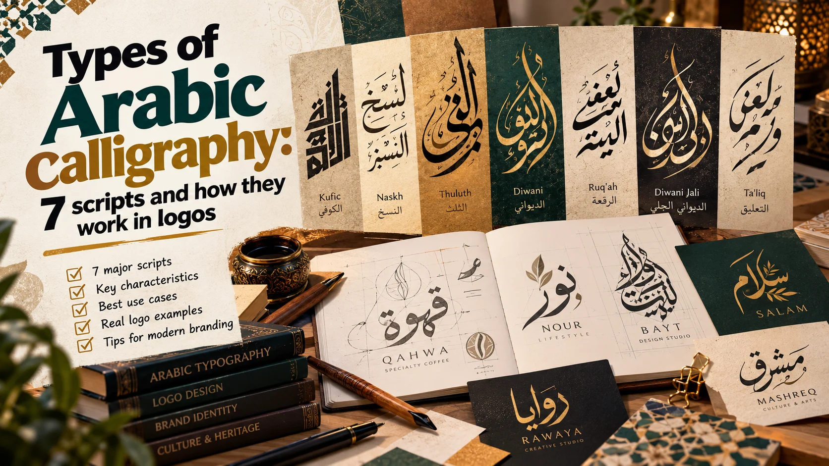
There are seven main types of Arabic calligraphy: Kufi (often spelled Kufic), Naskh, Thuluth, Ruq'ah, Diwani, Maghrebi and Nasta'liq, which most Arabs simply call "Farsi", the Persian script. Some have famous branches, such as square Kufi and Diwani Jali, and around all of them lives modern Arabic lettering.
All of them write the same alphabet. UNESCO, which added Arabic calligraphy to its Representative List of the Intangible Cultural Heritage of Humanity in 2021, describes 28 letters written in cursive, from right to left. Letters join, change shape with their position, and rely on dots. There are no capitals, so in a logo the whole character of a name comes from how its letters are drawn.
This is a designer's guide, not a calligraphy lesson. For each script: a little history from library and museum sources, its look, where you meet it today, and how it behaves in a logo. Then digital typefaces in each style, checked in October 2026, and examples from identities I have drawn.
The types of Arabic calligraphy at a glance
| Script | Origin | Look | In a logo |
|---|---|---|---|
| Kufi | Among the earliest surviving scripts | Straight, angular, geometric | Holds small; pairs easily with geometric Latin |
| Square Kufi | Architecture, such as Timurid Samarkand | Letters on a square grid | A strong symbol; long names become puzzles |
| Naskh | The script of books, codified by Ibn Muqla | Rounded, balanced, clear | Clearest and most familiar; quiet |
| Thuluth | Refined by the Ottomans | Wide curves, stacked letters | Grand; collapses when small |
| Ruq'ah | Ottoman, from the older Riqa' | Short, quick, plain | Friendly and local; holds small |
| Diwani | Ottoman chancery, 15th century | Highly cursive, unusual joins | Elegant; harder to read |
| Diwani Jali | Ornamental Diwani | A dense, decorated block | A seal shape; unreadable small |
| Maghrebi | North Africa and al-Andalus | Big bowls, its own dots for fa and qaf | Regional voice; can confuse Eastern readers |
| Nasta'liq | Iran, 14th century | Fluid, long horizontals | Poetic; hard to share a line with Latin |
Calligraphy, lettering and typeface
Three words often used as one:
- Calligraphy is written by hand, following rules and proportions learned from a master. UNESCO lists the traditional tools: a qalam cut from reed or bamboo, and ink of honey, soot and saffron.
- Lettering is drawn for one word, such as a brand name, with a pen or in Illustrator. It borrows from calligraphy and may break its rules when the idea needs it. Most Arabic logos are lettering.
- A typeface, or font, sets any text and repeats every letter the same way. It may imitate Naskh or Kufi, but it does not know which word you are typing.
Kababgy Al-Sultan, a grill house in Faqous, uses two of the three. The mark is hand-drawn lettering built as a round seal: the grill bars and flame sit on top of the word Kababgy, and the letters of Al-Sultan curl like smoke. The name and supporting text are set in a heavy, rounded Arabic typeface.
1. Kufi (Kufic)
History: one of the earliest Islamic scripts to survive, traditionally linked to Kufa in Iraq. The Library of Congress notes that it flourished in Abbasid Baghdad and grew many variations, before the rounder, more legible Naskh took over.
Look: straight strokes, clear angles, a strict baseline. Its branches include floriated, knotted and square Kufi.
Where you see it: mosques and buildings, many modern logos, and Kufi-based typefaces such as Cairo.
In a logo: the easiest script for a designer. Its geometry holds at small sizes, it can be drawn on a grid, and it sits beside a geometric Latin sans with little effort. The risk is looking generic: plain Kufi with no idea looks like a dozen tech logos.
Square Kufi
Kufi built on a square grid, with right angles only, so a word becomes a pattern. It belongs to architecture: the calligrapher and researcher Mamoun Sakkal has studied its patterns on Timurid Samarkand, including the Bibi Khanum mosque that Timur built at the end of the 14th century.
In a logo it makes an excellent symbol, one block that works as an app icon, a stamp or a pattern on a pack. But it reads like a puzzle, so keep it for a symbol or a short word, and set the full name clearly beside it.
2. Naskh
History: the name comes from the verb "to copy", and it became the standard script for documents and books. The Library of Congress credits the vizier and calligrapher Ibn Muqla (855 to 941) with standardising it through a system of proportion, later developed by Ibn al-Bawwab and refined by Yaqut al-Musta'simi.
Look: rounded, balanced letters with dots and vowel marks in their places.
Where you see it: books, newspapers, the printed Quran and most Arabic text typefaces. Microsoft says its Traditional Arabic font is based on the type of the Amiriya (Bulaq) Press in early 20th-century Cairo.
In a logo: the clearest of the scripts, right for education, publishing and services that need trust before flair. Its character is quiet, so the idea must come from the composition or colour. It sits naturally beside a classic Latin serif, since both grew from the book.
3. Thuluth
History: a grand, ornamental script for inscriptions and titles. The Museum of Anthropology at the University of British Columbia says it had developed by the late 9th century, and the Library of Congress says it reached its height in the Ottoman Empire under Shaykh Hamdullah in the 15th century.
Look: wide curves, barbed letter heads, and letters that link and cross in stacked compositions.
Where you see it: mosque walls and domes, the embroidered band of the Kaaba's covering, book covers and formal titles.
In a logo: Thuluth says "heritage" at first sight, and it is one of the hardest scripts at small sizes. The stacking that impresses on a sign becomes a blot on a profile picture. Draw a simpler companion version, and pair it with a calm Latin serif.
4. Ruq'ah
History: developed by the Ottomans from the older Riqa'. It is not treated as high art, but the Library of Congress calls it the most commonly used handwritten script in the Arab world. Do not confuse the two: Riqa' is attributed to al-Fadl ibn Sahl (died 818) and was used for letters; Ruq'ah is the later Ottoman hand.
Look: short, quick letters, few rises and drops, no ornament.
Where you see it: everyday handwriting, shop signs, and old Egyptian film posters, whose lettering inspired the Rakkas typeface.
In a logo: friendly and close to the street, good for restaurants, snacks and local brands. Its letters stay near the baseline, so it holds small, and it suits a humanist sans or a brush script. A simple Ruq'ah needs more precise drawing than it seems.
5. Diwani
History: the script of the Ottoman chancery, the diwan. The Library of Congress attributes it to Ibrahim Munif in the 15th century, influenced by the Persian Ta'liq, and says it was hard to read and harder to forge, which suited confidential documents.
Look: extremely cursive, with unconventional joins and words that flow into each other.
Where you see it: invitations, certificates and calligraphic art.
In a logo: elegant and fluid, a voice for occasions and refined hospitality. But a script designed to be hard to forge is also hard to read, so test it on someone who does not know the name. Pair it with a simple Latin.
Diwani Jali
An ornamental Diwani in which the spaces between letters are filled with dots and flourishes until the writing becomes one block. The Library of Congress credits Hafiz Osman with its development. It makes a beautiful seal shape and is close to unreadable when small, so let a clear name do the reading.
6. Maghrebi
History: a Kufi-derived script used across North Africa, al-Andalus and West Africa, known, says the Library of Congress, for its descending strokes, large bowls and sweeping loops.
Look: big bowls at the ends of letters, and dots that differ from the East: fa takes one dot below, qaf one dot above.
Where you see it: manuscripts, crafts and contemporary calligraphers of the Maghreb.
In a logo: a strong regional accent for a Moroccan kitchen or a North African craft brand. But a reader in Egypt or the Gulf may read a Maghrebi qaf as a fa, so soften that difference in the key letters of the name.
7. Nasta'liq (Farsi)
History: according to the Library of Congress, it is said to have been developed in the 14th century by Mir Ali Tabrizi, and its name joins Naskh and Ta'liq. It became the script of poetry, spread to South Asia, Central Asia and the Ottoman Empire, and Urdu relies on it almost entirely.
Look: fluid, with short verticals, long horizontals, and words that step down from the one before.
Where you see it: Iran and Pakistan, poetry books and calligraphic panels.
In a logo: poetic and refined. But Latin runs along a flat line while Nasta'liq steps down, so a stacked lockup, Arabic above and English below, usually works better than one line. Its Persian flavour is also obvious to Arab readers.
Modern Arabic lettering
The seven scripts are the classical tradition, passed from master to student. Modern Arabic lettering is several directions:
- Lettering for brands: drawn for one name, starting from a classical style, then simplified, gridded or merged with a picture.
- Poster lettering: Egyptian film posters of the 1950s and 60s inspired Rakkas, and Iranian posters of the 1960s and 70s inspired Lalezar.
- Calligraffiti: UNESCO notes that the practice now also uses markers, synthetic paint and spray paint.
- Crossovers: Blaka, by Mohamed Gaber, pairs Kufi with Latin blackletter.
Digital typefaces in each style
The Google Fonts families below are all under the SIL Open Font License, with designers checked in the library's official metadata in October 2026. The Windows fonts ship with Windows and appear in Office, according to Microsoft's typography pages. "None found" means none among the families I checked.
| Style | Google Fonts (designer) | Windows and Office |
|---|---|---|
| Kufi | Reem Kufi (Khaled Hosny, Santiago Orozco), Qahiri (Khaled Hosny), Kufam (Wael Morcos, Artur Schmal) | Andalus, after Kairawani Kufic |
| Naskh | Amiri (Khaled Hosny, Sebastian Kosch), Scheherazade New (SIL International) | Traditional Arabic, Sakkal Majalla, Arabic Typesetting |
| Thuluth | Katibeh (KB Studio), a Naskh with some Thuluth qualities | None found |
| Ruq'ah | Aref Ruqaa (Abdullah Aref, Khaled Hosny, Hermann Zapf), Rakkas (Zeynep Akay) | None found |
| Diwani | None found | Aldhabi, inspired by early Diwani |
| Maghrebi | None found | None found |
| Nasta'liq | Gulzar (Borna Izadpanah and team), Noto Nastaliq Urdu (Google) | Urdu Typesetting |
Windows fonts are licensed with Windows, so check Microsoft's terms before using them on a website or in an app. And any ready-made font lets anyone type the same name, which is why a drawn mark is safer. The licences are covered in free Arabic fonts for commercial use, and choosing a face for a mark in Arabic fonts for logos.
From my work
- Arabian Intelligence: a calligraphic Arabic mark in bold violet. The three words lock into one compact square, with an English line beneath for the company's partners, and that square holds from a business card to the building's sign.
- Al-Furqan, a platform teaching the Holy Quran online to students worldwide: the letters of the name rise into an open book, in gold for reverence and green for growth.
- Ashafaq, a hand car wash in Saudi Arabia: an Arabic wordmark drawn bold and tall with soap bubbles over it, in navy and sky blue, so the name reads from the road.
In each, as at Kababgy Al-Sultan, the letters carry one idea: a solid block, an open book, foam or smoke. That is the real test of a script in a logo.
How to choose a script for a logo
- Start from the audience and the place. A highway sign needs a clear Kufi or Naskh; a wedding invitation can carry Diwani.
- Test small sizes early, especially for Thuluth and Diwani Jali.
- Plan the Latin from the start. Kufi and Naskh share a line with English easily; Nasta'liq and Thuluth prefer a stacked lockup.
- Learn the rule before you break it. Arabic readers spot a wrong join or a misplaced dot at once. If you do not read Arabic, work with someone who does.
- Use no more than two styles: one for the mark, one quiet typeface for text.
The full method is in how to design a logo, and where calligraphic marks sit among other forms is in types of logos.
Conclusion
The types of Arabic calligraphy are voices to choose from, not names to memorise: Kufi steady, Naskh clear, Thuluth grand, Ruq'ah friendly, Diwani elegant, Maghrebi regional, Nasta'liq poetic. Learn where each comes from, then pick the one that carries your brand's idea and still reads where the brand will live.
If you want a mark drawn in Arabic lettering, alone or with English, tell me about your project.
Questions people ask
What are the main types of Arabic calligraphy?
Seven are usually counted as the main scripts. Kufi (Kufic), Naskh, Thuluth, Ruq'ah, Diwani, Maghrebi and Nasta'liq, which Arabs often call Farsi. Some have well-known branches, such as square Kufi and Diwani Jali, and modern Arabic lettering borrows from all of them.
What is the oldest style of Arabic calligraphy?
Kufi is among the earliest Arabic scripts to survive, and many early copies of the Quran were written in it. Its name is linked to the city of Kufa in Iraq. The rounder, clearer Naskh later took over as the script of books and offices.
What is the difference between Naskh and Thuluth?
Naskh is the clear, rounded script of books, newspapers and most printed Arabic. Thuluth is larger and ceremonial, with wide curves and letters that cross and stack, which is why it appears on mosques and in titles. Naskh is made to be read; Thuluth is made to be seen.
What is the difference between calligraphy, lettering and a font?
Calligraphy is written by hand with a pen, following rules and proportions. Lettering is drawn for one specific word, such as a brand name, and may bend those rules. A font, or typeface, is a system that sets any text the same way every time.
Which Arabic calligraphy style is best for a logo?
It depends on the brand and where the logo will live. Kufi suits modern brands and holds up at small sizes, Naskh is clear and familiar, and Ruq'ah feels friendly and local. Thuluth and Diwani look rich, but they need space and a simpler version for small sizes.

Keep reading
How to design a logo: a step-by-step method from brief to files
How to design a logo step by step, from the brief and idea to research, hand sketches, vector drawing, Arabic lettering, tests, the client and the files.

Logo design mistakes: 10 common errors and how to avoid them
Ten logo design mistakes I still see, from effects and stock icons to weak Arabic lettering, with a fix for each and a checklist to run before delivery.

What is a brand identity? Its elements, guide and process
A brand identity is far more than a logo. Its elements, the brand guide, how it builds trust and what a small business needs first, from real projects.